Friday 4 April 2014

Evaluation - Question 7

I recorded my answer and edited it on iMoviemaker then uploaded it onto Youtube.


Figure 1


Figure 2


Figure 3


Thursday 3 April 2014

Evaluation - Question 6

I created a slideshow to present my answer for evaluation question 6.


Evaluation - Question 5

I presented my answer on windows movie maker by creating a video for it then I uploaded onto dailymotion.


Evaluation - Q5 by clocsin

Wednesday 2 April 2014

Tuesday 1 April 2014

Evaluation - Question 3

What kind of media institution might distribute your media product and why?

The magazine publishing house that I believe will own my music magazine is IPC Media as most of the genres that they own are associated with the most used media such as TV programmes (TV Times magazine), fashion (Look magazine) and they also publish NME magazine which is an indie-rock music magazine.


"Pop it" magazine would be available online if readers prefer having a digital copy rather than a physical copy since IPC media publishes their magazines digitally as well as distributing the magazine to stores as a physical copy. The distributed physical copies of the magazine would be sold in traditional newsagents, supermarkets and bookstores (such as WHSmith). By selling the magazine both as a digital and physical copy, it should help increase the sales of the magazine since there's more availability to purchase the magazine.

The magazine would be circulated on a monthly basis so that means there would twelve issues of the magazine out in a year. Readers would be able to also subscribe to the magazine if they want to receive the new issue every month it comes out. 

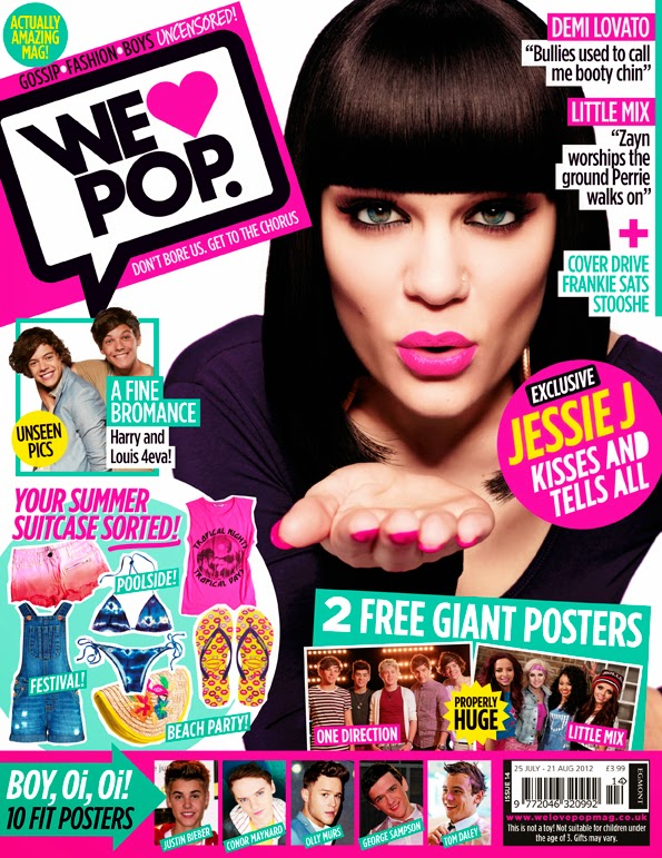
From my research, I found out that the average sale figures for the first half of 2012 for 'Top of the Pops' magazine is 78,352 and for 'We love pop' magazine it's 50,505. I also found that the average sale figures for the first half of 2013 for 'Top of the Pops' is 63,483 and for 'We love pop' magazine it's 42,864. There is a decrease in the average sales for both magazines which could be due to teenagers not wanting to buy the magazines as they are either expensive or they don't want to spend their money on buying magazines since they could use their money to buy something that will benefit them in the long run whereas a magazine can keep them entertained for a short time before getting bored or finishing it. I don't think the pop magazines are doing very well in sales due to the massive decrease in sales from the first half of 2012 and 2013. This could suggest that people are moving on from pop onto another genre of music which indicates that pop seems to be a genre that's dying out slowly before new creations for pop music becomes extinct in the future.


Monday 31 March 2014

Evaluation - Question 2

Evaluation - Question 1

In what ways does your media product use, develop or challenge forms and conventions of real media products?

Figure 1


Figure 2


Figure 3


Figure 4


Figure 5

Front CoverContents page


Wednesday 26 March 2014

Font Research and Analysis

For the title of my magazine, I wanted my masthead to be bold yet it had to fit the genre and not look too techno since most fonts I saw looked quite techno so it was a bit difficult for me to apply it to be the masthead of a pop magazine. I did some experimenting of the different fonts before choosing  4 I believe I could apply and then the final one that got chosen to be applied to the front cover of the magazine.

The first one, I chose because I thought it looked quite bold and the style was san-serif which made it look professional. However, I didn't think it would've went well with the whole design of the magazine overall so I decided not to use that one.

The second one, I chose because it looked similar to the fonts used on a professional pop magazine front cover so I thought that it would make a good mast head since it would suit the design and layout. Then, I realised it didn't stand out as much and wasn't that bold so it wouldn't really look eye-appeal on the front cover.

The third one was similar to the second one except that it's bolder. I decided that I could possibly used this as the mast head as it was similar to the second font and it looked good on my front cover. I decided not to use this to be the final design for the masthead because it still looked quite plain even though it was bold and stood out from the colours. It still did look quite bland so I decided against using it.

The fourth one used the same font as the third one except that I changed the 'it' into lower cases and gave it a circle background. I thought that it looked a bit more colourful and I might be able to use it for the mast head since it would stand out even more now that it matched the colour scheme a bit more. However, I thought that having it completely black made it look quite negative and depressing even with all the bright colours surrounding it so I decided not to use it as my masthead.

The fifth font is the same font except that it's a bit more rounded on the corner and edges. Also, I changed the colour filling to white with a black outline and I changed the background drop for 'it' into an explosion-design as well as changing the 'O' into a circle with a star. Since I thought the font being black was depressing, I changed it into white which made it stand out even more with the black outline. I changed the 'O' into a circle with a star in it because I thought that I could make it relate more to the genre by adding a star and making it look like the shape of a round bubblegum ball. I changed the 'it' background into an explosion-design because when I thought of 'pop it', it reminded me of a blown up bubblegum balloon being blown up and then popping so that's why I used an explosive-design to represent a bubblegum balloon being popped. This was my final choice for my masthead because the colours I also added worked with the colour scheme and it made it stand out even more from the front cover which makes the appearance look more appealing towards readers.


This is the final front cover image with my final choice for the masthead being used.